Pareto Chart
The traditional usage of a Pareto chart displays individual values in a descending order as bars, with the cumulative total represented by the line.
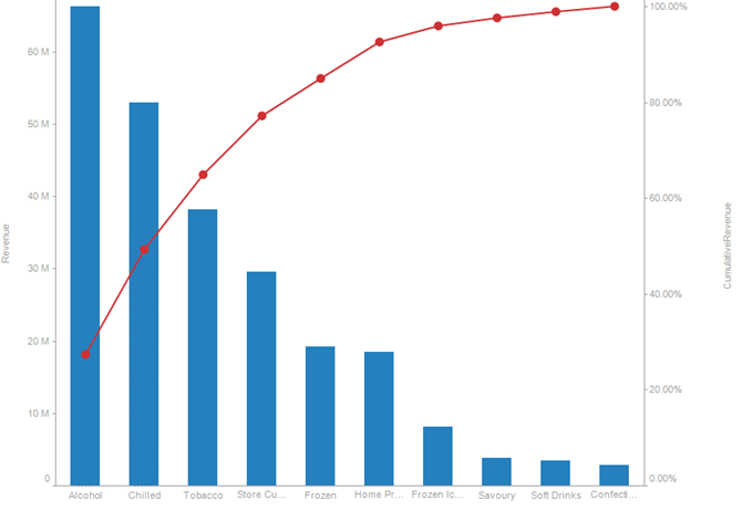
Figure 4-44. A classic Pareto chart.
A common usage of the Pareto chart is to compare actual values to forecast/target values, with the actuals being displayed as the bar, and the forecast as the line. In this scenario, typically both measures are bound to the left Y axis, so that they have comparable scales.
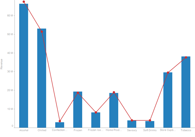
Figure 4-45. Displaying actuals vs. forecast values.
(c) 2023 Altair Engineering Inc. All Rights Reserved.