Price Bands Graph
Each grouping defined in the breakdown will be displayed as a separate layer of the overall graph, where typically color is used to display the category.
As it is expected that spread layers will occlude, the transparency is defaulted to 50% and can be modified as appropriate.
Typical use cases include comparing the pricing bid offer spreads from multiple liquidity providers.
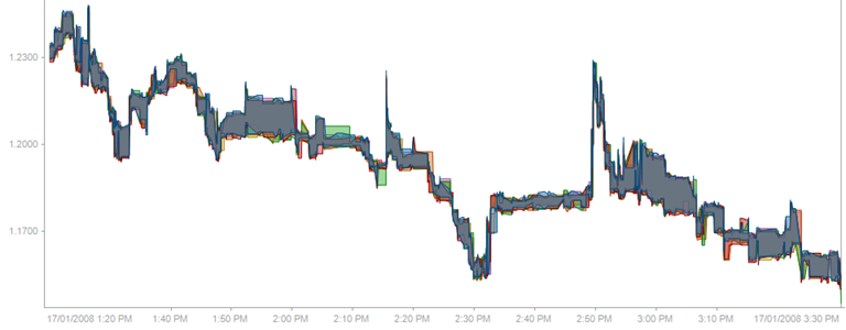
Figure 3-23. A price bands graph with inner interpolation.
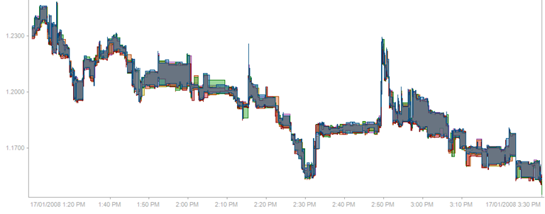
Figure 3-24. A price bands graph with stepped interpolation.
(c) 2023 Altair Engineering Inc. All Rights Reserved.